


Learn how to read crypto price chart beginners with our ultimate 2026 step-by-step guide. Master candlesticks, timeframes, and indicators easily!
Looking at a cryptocurrency exchange for the first time can feel like staring at a control panel of a spaceship. Green and red bars flashing everywhere, random lines zigzagging across the screen, and numbers changing at lightning speed. It is completely normal to feel overwhelmed. However, if you want to navigate the digital asset space safely, learning how to read crypto price chart beginners guides is the absolute first skill you need to master before risking your hard-earned capital.
Think of a price chart as the physical footprint of the crypto market. It tells you exactly where the money is flowing, who is currently winning the fierce tug-of-war between buyers and sellers, and where the price might go next. You do not need a degree in finance or advanced macroeconomics to understand these visual movements. By breaking down the complex raw data into simple, digestible elements, this 2026 step-by-step tutorial will teach you exactly how to read crypto price chart beginners setups look at every single day to make smart, deeply informed market decisions.
Before diving into the charts, if you are completely new to the space, it is highly recommended to understand the fundamentals first by reading [What Is Cryptocurrency 2026]. If you want to focus on the king of digital assets, check out [What Is Bitcoin 2026] and learn the basics of purchasing through our guide on [How to Buy Bitcoin].
1. The Anatomy of a Crypto Chart: What Are You Actually Looking At?
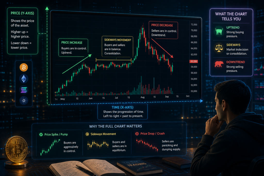
When you open a professional charting platform like TradingView.com for the first time, it is easy to feel overwhelmed by the sheer volume of data flashing on your screen. However, stripping away the noise reveals a highly structured, historical record of asset prices. For anyone actively searching for how to read crypto price chart beginners resources, the absolute first milestone is understanding the two fundamental axes that form the foundation of every single price graph:
-
The Horizontal Axis (X-axis): This line runs along the bottom of your screen and represents time. As you move from left to right, you are traveling forward in time, allowing you to track how an asset performed over minutes, days, months, or even years.
-
The Vertical Axis (Y-axis): This line runs up the right or left side of your screen and represents the exact price of the cryptocurrency. It allows you to instantly gauge the current and historical fiat or stablecoin value of the digital asset you are analyzing.
When you master the basic layout of this grid, you realize that a price chart is simply a visual map of historical supply and demand. Every fluctuation, spike, and drop is a real-time data point showing exactly how much market participants were willing to pay at any given second in history.
Why You Can’t Rely on Just the Current Price
Imagine trying to understand the entire story of a football match by looking only at the final score on a scoreboard. You know which team walked away with the victory, but you have absolutely no idea how the game actually played out. Was it a dominant, one-sided blowout? Did one team make a miraculous, last-minute comeback from a massive deficit? Was the game plagued by fouls and hesitation?
Relying solely on the current price ticker of a coin gives you that exact same zero-context experience. Knowing that Bitcoin is currently priced at a specific dollar amount tells you nothing about where it is likely to go next, because you are missing the journey it took to get there.
[Price Spike/Pump] -> Buyers are aggressively in control
[Sideways Movement] -> Buyers and sellers are in equilibrium (consolidation)
[Price Drop/Crash]  -> Sellers are panicking and dumping supply
A complete price chart gives you the entire backstory. It shows you whether a coin is currently crashing from an unsustainable peak, steadily pumping due to long-term accumulation, or simply moving sideways in a period of boring consolidation.
Developing a deep understanding of how to read crypto price chart beginners workflows allows you to look past the raw numbers and see the market’s raw emotion—fear, greed, conviction, and hesitation—painted clearly right on your screen. By observing the trajectory, speed, and patterns of the price movement, you gain the critical context needed to make rational decisions instead of emotional guesses.
2. Deciphering Candlestick Charts: The Language of the Market
If line charts are like reading a children’s book summary, candlestick charts are like reading the original, unabridged epic novel. Most cryptocurrency exchanges and premium platforms default to displaying these “candlestick charts” because they squeeze an immense amount of historical data into one highly visual package. At first glance, they look like a dense forest of green and red rectangular blocks with little strings poking out of the top and bottom.
Every single newcomer learning how to read crypto price chart beginners fundamentals must know that each individual candlestick represents the exact price action of an asset over a specific, chosen time block. Whether that block is one minute, one hour, or an entire day, the candle records the historical footprints of buyers and sellers over that duration.
          [High Price]  <--- Top tip of the upper wick
               │
         ┌─────┴─────┐
         │           │  <--- Open or Close price
         │   Real    │       (Position depends on candle color)
         │   Body    │
         │           │
         └─────┬─────┘
               │        <--- Bottom tip of the lower wick
          [Low Price]
The 4 Pillars of a Candlestick (OHLC)
To master how to read crypto price chart beginners layouts, you need to understand that every single candle communicates four precise mathematical data points, commonly abbreviated as the OHLC metrics. These four numbers tell you exactly how the market opened, moved, and settled during the candle’s lifespan:
-
Open (O): This represents the exact market price of the cryptocurrency at the very first second the time period began.
-
High (H): This shows the absolute peak, maximum price that buyers managed to push the coin up to before the session closed.
-
Low (L): This marks the absolute bottom, minimum price floor that sellers managed to drag the asset down to during that same timeframe.
-
Close (C): This is the final market price recorded at the very last second before the time period expired and a new candle was generated.
Understanding how these four nodes interact is a massive milestone when practicing how to read crypto price chart beginners routines, as it lets you reconstruct the entire historical battle without needing to watch it live.
Green Candle vs. Red Candle: Who Won the Battle?
The colors on your screen are not just decorative; they function as an instant visual scorecard showing who won the fierce psychological tug-of-war between the bulls (buyers) and the bears (sellers).
The Green Candle (Bullish Momentum)
A green candle signals a victorious session for the buyers because the asset price moved upward. For a green candle, the Open price sits at the flat bottom of the solid rectangular block (the real body), while the Close price is located at the flat top. This structure tells you that demand outpaced supply, forcing the price to settle higher than where it started.
The Red Candle (Bearish Momentum)
A red candle indicates a clear win for the sellers because the asset price moved downward. Because the market dropped, the positions invert: the Open price sits at the flat top of the solid body, and the Close price rests at the bottom edge. This visual pattern proves that panic or profit-taking ruled the session, allowing supply to overwhelm active buyers.
The Wicks and Shadows (Market Hesitation)
The thin vertical lines extending above and below the solid body are called wicks or shadows. These are incredibly valuable elements when studying how to read crypto price chart beginners guides, because they show you the extreme boundaries reached during the session.
Reading between the lines: If you spot a tiny green body with an incredibly long upper wick, it reveals a massive psychological story. It means buyers initially went into a frenzy, aggressively pumping the price sky-high (the top of the wick). However, before the session ended, sellers forcefully stepped in, rejected that higher price, and slammed it all the way back down near the opening level.
As you get comfortable with how to read crypto price chart beginners strategies, simply observing the proportional size of the candle bodies versus the length of their wicks will give you a profound understanding of market momentum without forcing you to learn complicated, advanced math.
3. Mastering Timeframes and Market Volume
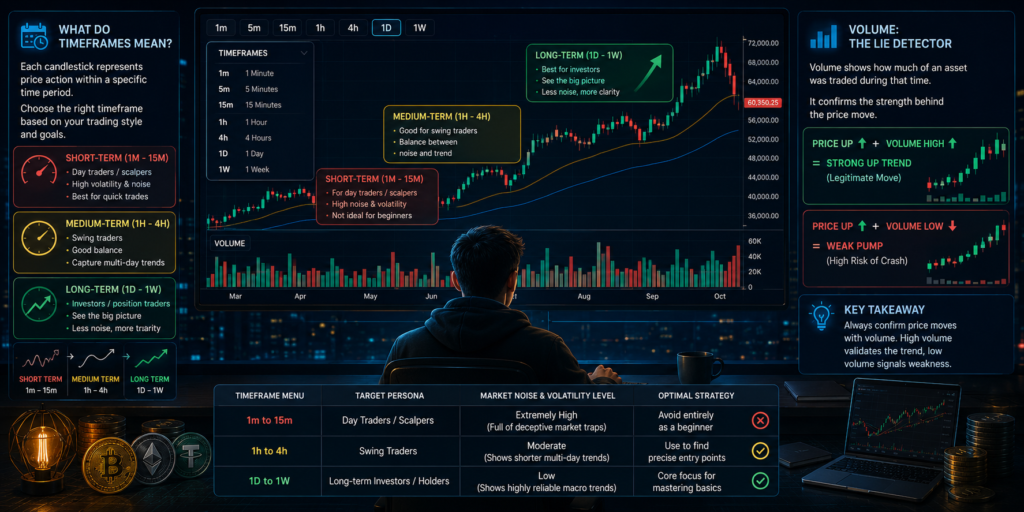
One of the absolute biggest roadblocks that causes confusion when studying how to read crypto price chart beginners resources is choosing the right timeframe. When you open up an interface on platforms like Binance or TradingView, you will immediately notice a top navigation menu packed with intimidating letters and numbers like 1m, 5m, 15m, 1h, 4h, 1D, and 1W. Misunderstanding what these mean is a primary reason why many newcomers lose their capital early on.
What Do Timeframes Mean?
The timeframe setting completely reshapes the reality of what you see on your screen. If you select the 1-Hour (1h) timeframe, every single candle on your screen is compressed to represent exactly 1 hour of trading activity. Once that hour expires, a brand new candle forms to record the next hour. If you switch to the Daily (1D) timeframe, each individual candle now represents a full 24-hour cycle of global trading.
Choosing your specific view depends entirely on your investment goals, your risk tolerance, and your emotional patience. To make this easy to digest, we can categorize these views into three distinct lenses:
-
Short-Term Timeframes (1m, 5m, 15m): These hyper-fast intervals are used primarily by hyper-active day traders who buy and sell digital assets within minutes to catch tiny price fluctuations. For anyone just starting out and practicing how to read crypto price chart beginners strategies, staring at these low timeframes usually feels like looking at chaotic, random static noise. It is highly volatile, extremely stressful, and often displays fake price movements that mean nothing in the grand scheme of things.
-
Medium-Term Timeframes (1h, 4h): These are fantastic tools for intermediate “swing traders” who hold assets for a few days or weeks. They provide a beautifully balanced sense of where the price is heading over the coming week without requiring you to watch the screen every single second.
-
Long-Term Timeframes (1D, 1W): This is exactly where every single beginner should start their technical journey. The daily and weekly charts act as a natural filter that irons out day-to-day market panic, allowing you to clearly see the real macro trends, institutional accumulation phases, and market cycles of a digital asset.
| Timeframe Menu | Target Persona | Market Noise & Volatility Level | Optimal Strategy |
| 1m to 15m | Day Traders / Scalpers | Extremely High (Full of deceptive market traps) | Avoid entirely as a beginner |
| 1h to 4h | Swing Traders | Moderate (Shows shorter multi-day trends) | Use to find precise entry points |
| 1D to 1W | Long-term Investors / Holders | Low (Shows highly reliable macro trends) | Core focus for mastering chart basics |
Volume: The Lie Detector of Crypto
Directly beneath your rows of candlesticks at the very bottom of your interface, you will see a series of vertical bars tracking along the X-axis. This represents Trading Volume. Volume indicates the total amount of a specific cryptocurrency that was physically bought and sold during that selected timeframe.
If you want to master how to read crypto price chart beginners systems like a professional, you must learn to view volume as the essential fuel driving a vehicle. Without fuel, the vehicle cannot sustain its momentum.
Price Up  ▲  +  Volume High ▲  =  Strong, Healthy Uptrend (Legitimate Move)
Price Up  ▲  +  Volume Low  ▼  =  Weak, Deceptive Pump (High Risk of Crash)
Imagine a scenario where a coin’s price suddenly breaks out, jumping up 10% in a single day. If you glance down and see that this movement is backed by massive, towering green volume bars, it tells you that a huge, legitimate wave of buyers is aggressively fueling the move. The market is in agreement.
Conversely, if the exact same coin jumps 10% but the corresponding volume bars are tiny and microscopic, a major warning sign should go off in your head. It means very few market participants are actually backstopping the price pump. The move is fragile, likely engineered by low liquidity, and the price could instantly crash straight back down the moment a single whale decides to sell.
When you are actively practicing how to read crypto price chart beginners analytical workflows, always use the volume bars as your personal lie detector to instantly verify whether a rapid price surge is a highly sustainable move or a deceptive fake-out designed to trap emotional buyers.
4. Support, Resistance, and the 3 Simplest Indicators for Beginners
You do not need to fill your screen with dozens of complex technical lines. To successfully execute how to read crypto price chart beginners routines, you only need to understand two structural concepts and three simple, time-tested tools.
Support and Resistance: The Floor and the Ceiling
The market has a memory. Prices tend to stop and reverse at certain psychological levels.
-
Support (The Floor): This is a price level where a falling coin struggles to drop below. Why? Because buyers view the price as “cheap” or a “good deal” and step in to buy, creating a floor.
-
Resistance (The Ceiling): This is a price level where a rising coin struggles to break above. Sellers see this as a profitable area to sell, pushing the price back down.
Imagine a tennis ball bouncing inside a room. The floor is your support, and the ceiling is your resistance. If the ball breaks through the ceiling, that old ceiling often becomes the new floor!
The 3 Simplest Indicators Explained Simply
Indicators are mathematical tools that help smooth out price data to make trends easier to see. You can add these to your charts for free on sites like TradingView.com.
1. Moving Average (MA)
A Moving Average takes the average price of a coin over a certain number of days and plots it as a smooth, continuous line. For instance, a 50-day MA adds up the closing prices of the last 50 days and divides it by 50.
-
If the price is consistently above the MA line, the coin is in an uptrend.
-
If the price is consistently below the MA line, the coin is in a downtrend.
2. Relative Strength Index (RSI)
The RSI is a momentum meter that ranges from a score of 0 to 100. It tells you whether a cryptocurrency is being overbought or oversold by the market.
-
RSI above 70 (Overbought): The asset is running hot. Buyers have been screaming in, and the price might be due for a cool-down or correction.
-
RSI below 30 (Oversold): The asset is beaten down. Everyone has sold in panic, and it might be getting close to a potential bargain buying zone.
3. Moving Average Convergence Divergence (MACD)
The MACD is a trend-following tool consisting of two lines that cross over each other.
-
Bullish Crossover: When the fast line crosses above the slow line, it suggests upward momentum is building.
-
Bearish Crossover: When the fast line crosses below the slow line, it signals downward momentum is taking over.
As you learn how to read crypto price chart beginners models, use these indicators purely as supporting evidence. Never buy a coin just because an indicator says so; ensure the overall price structure looks healthy too.
5. Common Pitfalls to Avoid and FAQ for On-Chart Success
Even after soaking in a comprehensive how to read crypto price chart beginners manual, translating that visual knowledge into real-world success can be a major emotional challenge. The moment your own hard-earned money is on the line, fear and greed can easily warp your judgment, causing you to make classic, rookie mistakes.
To help protect your capital, let’s pull back the curtain on the most notorious traps that catch newcomers off guard. These insights are sourced directly from seasoned market veterans and time-tested learning platforms like the Binance Academy guide, ensuring you build healthy charting habits right from day one.
3 Fatal Mistakes Crypto Beginners Make
1. Zooming In Way Too Close
The most common trap for anyone figuring out how to read crypto price chart beginners setups is what traders call “micro-scoping.” Newcomers often spend their entire day glued to their phones or laptops, anxiously watching the 1-minute or 5-minute charts. They end up sweating over a tiny $20 drop in Bitcoin, completely unaware that on the daily chart, that same drop is an invisible blip in a massive, healthy uptrend. Staring at ultra-low timeframes feeds anxiety, ruins your sleep, and forces emotional panicking. If you want to keep your peace of mind, make it a rule to zoom out to the daily (1D) macro charts.
[1-Minute Chart]:  /\_/\_/\_/\_/\  <--- Pure panic, looks like a disaster!
[Daily Chart]:     /               <--- Clear, calm, healthy uptrend.
2. Overcomplicating the Screen (The Spaghetti Trap)
When you first discover technical indicators, it is incredibly tempting to add all of them to your workspace. Before you know it, you have three different Moving Averages, Bollinger Bands, the RSI, the MACD, and a dozen random lines cutting across your screen. Your chart quickly transforms into a confusing bowl of colorful spaghetti.
This leads directly to “analysis paralysis,” where one indicator tells you to buy, another tells you to sell, and a third tells you to wait. You end up completely frozen. If you look at how top professionals execute how to read crypto price chart beginners strategies, you will notice their screens are remarkably clean. Keep it simple: stick to the raw price action, market volume bars, and one or two indicators at most.
3. FOMO Buying Directly into a Resistance Ceiling
Fear Of Missing Out (FOMO) is the ultimate portfolio killer in cryptocurrency. Imagine a coin has been pumping aggressively for three days straight. You watch it shoot up, panic that you are missing the boat, and market-buy in a frenzy.
Unknowingly, you just bought the asset at the exact moment it slammed into a major, historical resistance ceiling—the precise zone where wealthy whales have set orders to take their profits. The price instantly rejects that ceiling and crashes, leaving you holding an immediate loss. An essential rule of how to read crypto price chart beginners systems is to never chase a vertical green candle. If a coin is resting right beneath a known resistance level, you must patiently wait for the price to break above that ceiling convincingly and turn it into support before you even think about jumping in.
Frequently Asked Questions (FAQ)
Navigating the crypto markets can be incredibly intimidating, and it is completely normal to have lingering questions as you build your trading foundation. Below, we break down the most common questions newcomers ask when searching for how to read crypto price chart beginners resources, giving you the direct clarity you need to move forward confidently.
Q: Which chart type is best for a beginner?
A: Candlestick charts are universally considered the absolute best option for investors of all skill levels. While standard line charts might look cleaner and less intimidating at first glance, they only show you a single data point: the closing price.
By avoiding candlesticks, you miss out on the vital intraday battle between buyers and sellers. Learning how to read crypto price chart beginners layouts using candlesticks ensures you get four times the market data (Open, High, Low, Close) from the exact same screen space, giving you a massive advantage in understanding market sentiment.
Q: Can charts predict the future with 100% accuracy?
A: Absolutely not, and anyone who tells you otherwise is trying to sell you something. When you study how to read crypto price chart beginners indicators and patterns, you are not learning how to look into a magical crystal ball. Instead, you are learning how to manage probabilities and risk.
Price charts track historical human behavior, fear, and greed. Because human psychology repeats itself, certain chart patterns tend to yield similar outcomes over time. Your goal when looking at a chart is simply to find setups where the odds are tilted in your favor, allowing you to cut losses quickly if the market goes against you.
Q: Do these charting principles apply to all cryptocurrencies?
A: Yes, the core principles of support, resistance, candlesticks, and volume apply to every single digital asset in the space, from Bitcoin to the newest altcoin. This is because charts do not measure the technology of a coin; they measure the collective psychology of the people trading it.
However, a massive rule to remember as you practice how to read crypto price chart beginners techniques is that smaller altcoins have drastically lower trading volume. This lower liquidity means their charts can be incredibly erratic, volatile, and far easier for wealthy investors (whales) to manipulate compared to heavyweights like Bitcoin or Ethereum.
Q: How much time should I spend looking at charts every day?
A: As a beginner, less is almost always more. Staring at charts for hours on end usually leads to over-trading, emotional exhaustion, and forced decisions. When starting your how to read crypto price chart beginners educational journey, dedicate just 15 to 30 minutes a day on the daily (1D) or 4-hour (4h) timeframes. This keeps you focused on the high-value macro movements without sucking you into the high-stress, addictive cycle of watching every single tick of the clock.
Conclusion
Learning how to read crypto price chart beginners guidelines is a superpower in the digital financial world. It transforms you from a speculative gambler relying on random social media hype into an objective observer who understands market behavior. Start slow, utilize free platforms like TradingView.com to practice drawing support and resistance lines, and always focus on the larger timeframes before risking your hard-earned capital.
Disclaimer: Cryptocurrency trading and investing involve significant financial risk. The content provided in this article is strictly for educational purposes and should not be construed as financial, investment, or trading advice. Always conduct your own research and consult with a licensed professional before making financial decisions.